
What does your team do again?
Every time someone at a conference asks me this question, I always have troubles coming up with a simple, concise answer. In academia, the research interests of the members of one team are hardly the same. Sometimes, there is no overlap at all between the interests of members of the same team. Yet, their interests must be related somehow, otherwise they wouldn’t be in the same team to begin with.
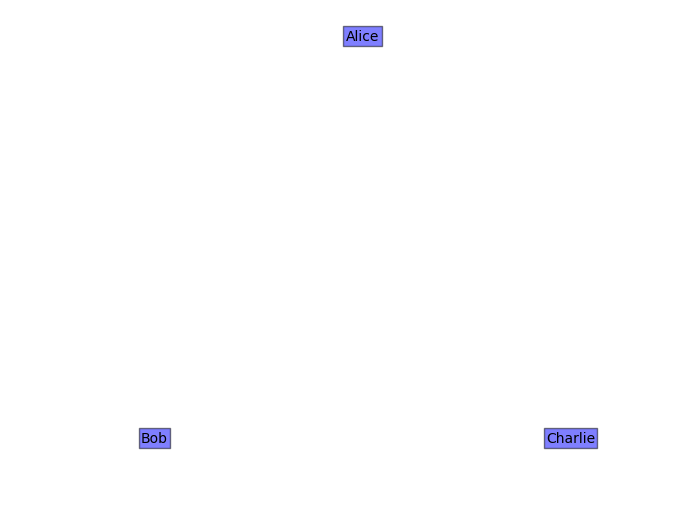
Research interests are usually found in the form of short lists of keywords on the researchers’ homepages. Even ignoring incomplete or outdated information, it is still hard to measure, or at least get an insight of, the homogenity of a teams research as a whole. We could measure the overlap of lists of keyword, so that Alice (computer networks, simulation, security) and Bob (simulation, graphics, human-computer interaction) have a research interests overlap of 1. Charlie (simulation, usability, ray tracing, user interfaces) also has an overlap of 1 both with Alice and with Bob. Let’s plot the researchers in this example on a plane, with their respective distance proportional to the similarity of their interests according to their overlaps:
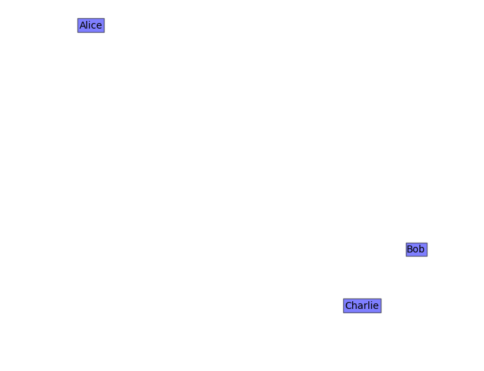
Let’s take a closer look at the keywords though. It seems that the research of Charlie is much more similar to that of Bob rather than Alice’s. Ray tracing is somewhat related to computer graphics, user interfaces and human-computer interaction are clearly similar fields. Actually the plot above should look like this:
Obviously the simple model based on keyword overlap is not able to capture the finer aspects of the semantics of the keywords. Can we do better? Enter distributional semantics.
Distributional semantics looks like magic, but, at its core, is just a refined way of counting words that tend to occur together often, and uses that information to compute word-to-word similarities. Much has been already written about this topic (my favourite introduction is Dminic Widdows’ book Geometry and Meaning) so I’ll skip the details. At this moment, the state of the art in distributional models seems to be word2vec, a predictive model that reads large quantities of text and outputs a word vector space, that is, a list of highly dimensional (50-300, typically) vectors, each associated with one work in the original vocabulary. Two words can be compared by calculating the cosine distance between their respective vectors: the closer the vectors, the more semantically similar the words.
I used distributional semantics to compute a vector space of people and interests in my research team. I took the interest keywords from self-submissions from the team members and I added my own, based on the presentations I attended at annual seminary. I used word2vec with a pretrained model of English words from the GloVe project. Some adjustments are necessary, such as calculating the vectors for compound terms (e.g., Natural Langauge Processing) as the sum of the single word vectors. The vectors for the team members are computed as the sum of the vectors of their respective interests.
The last step is the visualization. Obviously, there’s no way of visualizing points in 300 dimensions, so some form of projection, or dimensionality reduction, is needed. I used t-SNE, a much acclaimed algorithm for dimensionality reduction particularly designed with visualization in mind. Here’s the result, plotted with matplotlib:
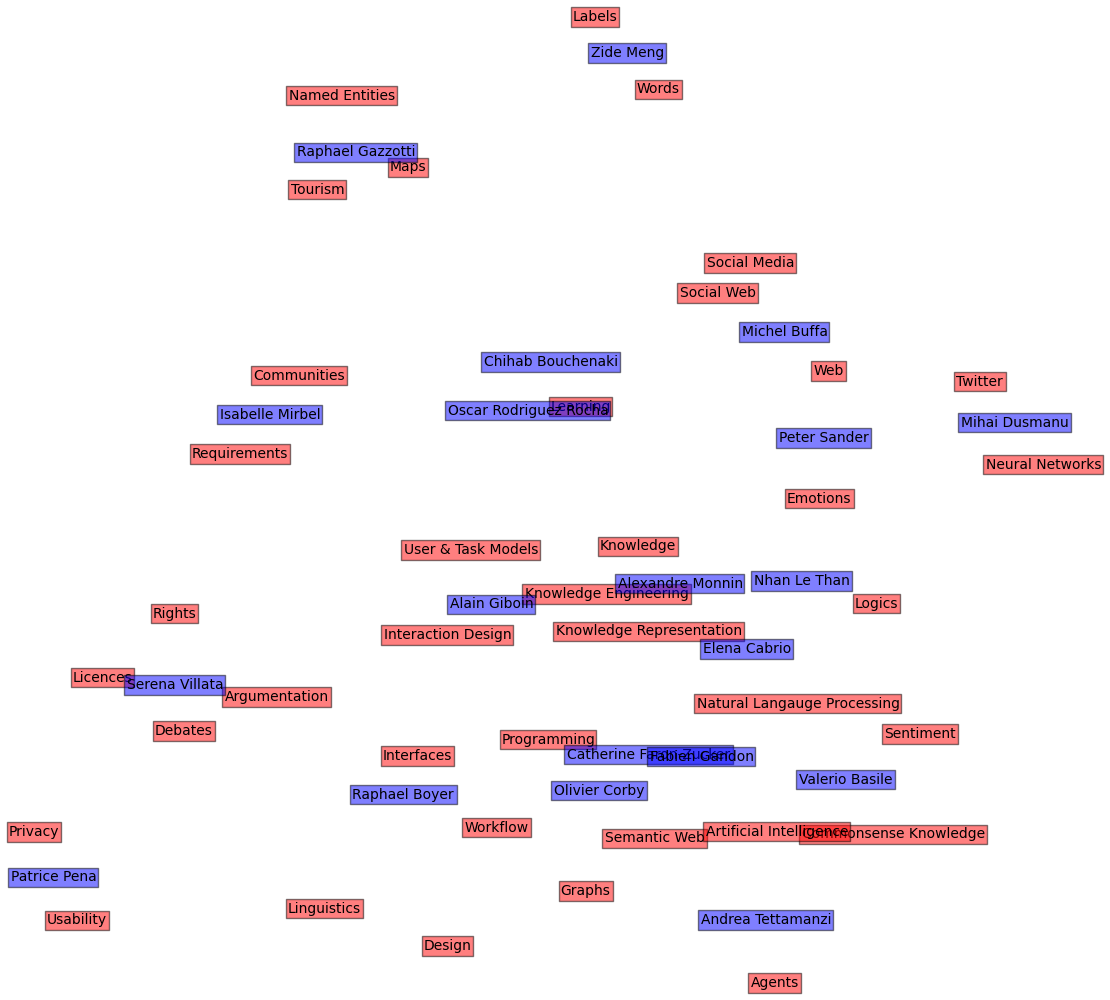
Since the people vectors and the interest vectors live in the same geometric space, they can be plotted together. t-SNE ensures, up to a certain extent, that vectors with high cosine similarity in the original space are plotted close to each other in the 2-dimensional plane. Note how “Social Media”, “Social Web”, “Web” and “Twitter” all end up together.
All of this is, of course, perfectible. The lists of interests, to start, are highly incomplete and subjective. There is no account for the compositionality of language: “Artificial Intelligence” is arguably more than “Artificial” + “Intelligence” (this is a highly debated topic in linguistics and semantics). t-SNE also seems to have its shortcomings, with similar labels sometimes ending up too far apart.
Nevertheless, it’s been a fun afternoon project in under 50 lines of Python, and perhaps we now know a little bit more about our own work.
EDIT 9/8/2016
The picture above is nice, but it has something that really bothers me: overlapping labels. So I exported the coordinates, the labels and the respective colors, and I imported them into R. Here, I used the popular plotting library ggplot to make a new plot. More interestingly, I used a new library called ggrepel to have the labels in the plot sort of repelling each other, so they are not intersecting anymore. It still takes some adjustment, if the plot is too crammed the labels will still overlap sometimes, but the result is beautiful:
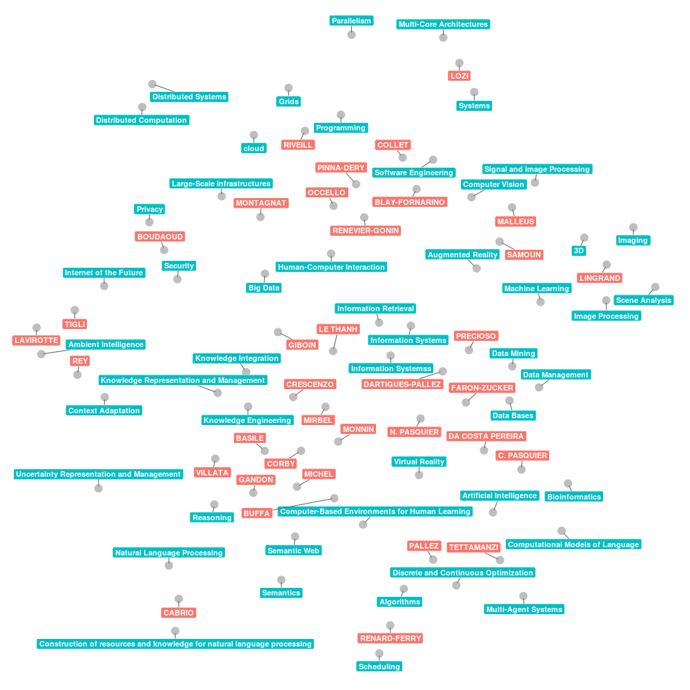
Also, this map is more complete and contains the research interests of most members of the SPARKS joint team.